Watercolor plots
R has been recognised as the most powerful statistical tool for displaying graphs. In the last years, R’s awesomeness in depicting relationships between variables is exploding with great packages such as ggplot2. One can simply walk around some R blogs, and find something like this:
The ‘watercolor’ plot (aka à la Solomon Hsiang).
Once you click these links above, you will forget completely about my blog, so… wait! I have to show a graph I made with the code provided there! Here it is, isn’t beautiful?
The plot:
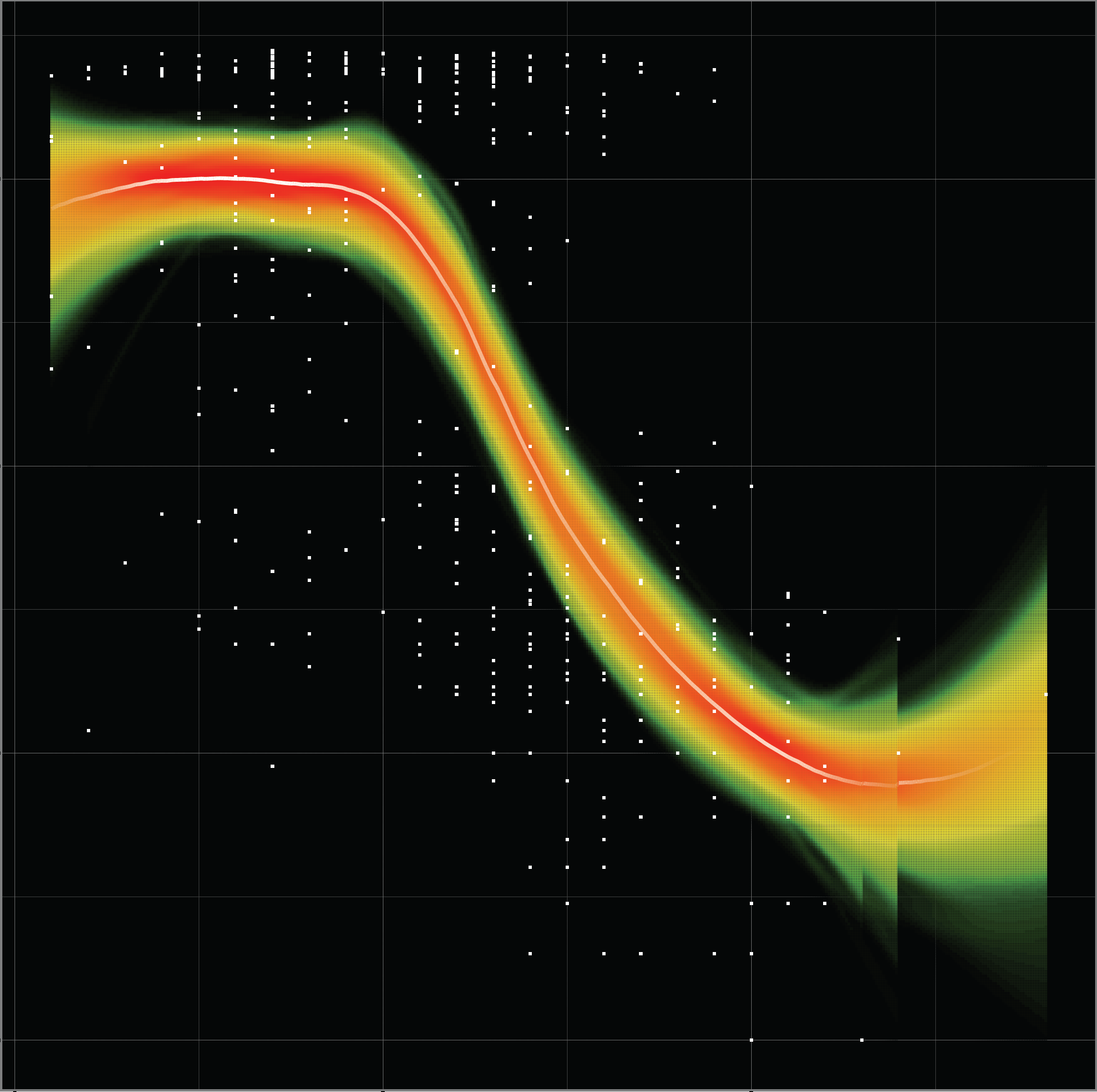
Comet plot… also aurora plot
This black background is a little tweak from the plain one… Here’s the line of code I modified from the original of Felix Schönbrodt:
you can change this line:
gg.points <- geom_point(data=data, aes_string(x=IV, y=DV), size=1, shape=shape, fill="white", color="black")for this one (you can tweak more parameters in it like the size of the points):
gg.points <- geom_point(data=data, aes_string(x=IV, y=DV), size=1, shape=shape, fill="white", color="white")then I run the function adding my black background (surrounded by a white background):
p <- vwReg(......, shape = 21, ......)

p + theme(
panel.background = element_rect(fill = "black",colour = NA),
panel.grid.minor = element_line("gray28", size = 0.1),
panel.grid.major = element_line("gray48", size = 0.1),
plot.background = element_rect(fill = "white",colour = NA))
And another one, in white background.. (and spaghetti = TRUE)
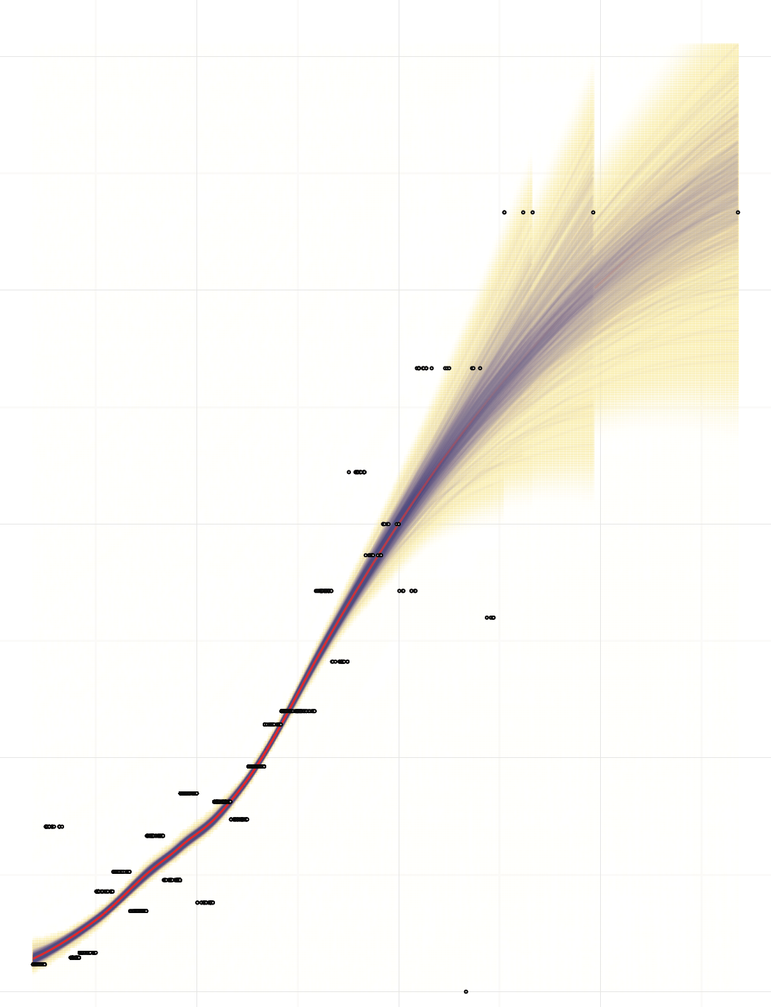
Spaghetti Euroscores
